Completely redesigning the BlueCat website in record time
BlueCat Networks is a business to business software company specializing in enterprise network management and cybersecurity DNS solutions. Headquartered in Toronto, Canada, BlueCat operates in 17 countries and serves over 1100 customers worldwide.
Historically, the majority of BlueCat’s business was won through a high-touch sales process, with marketing playing only a minor supporting role. As the market changed, competition grew, and a new Board of Directors was appointed, the go-to-market strategy was refocused on marketing as a primary driver for growth.
The Challenges
A CASE OF MISTAKEN IDENTITY
Despite having several Fortune 500 companies as clients, BlueCat has minimal brand awareness outside of their client-base. Adding to their brand awareness challenge, BlueCat was often confused with another vendor in a similar space called BlueCoat.
A SMALL FISH IN A BIG BIG POND
BlueCat had recently launched ‘Enterprise DNS’, a network-security product, bundled with its core DNS service. The goal of the product launch was to expand the customer base from network professionals to a broader security market. BlueCat now went from a market with four to five competitors to a crowded security market competing with thousands of companies.
SAME OLD, SAME OLD
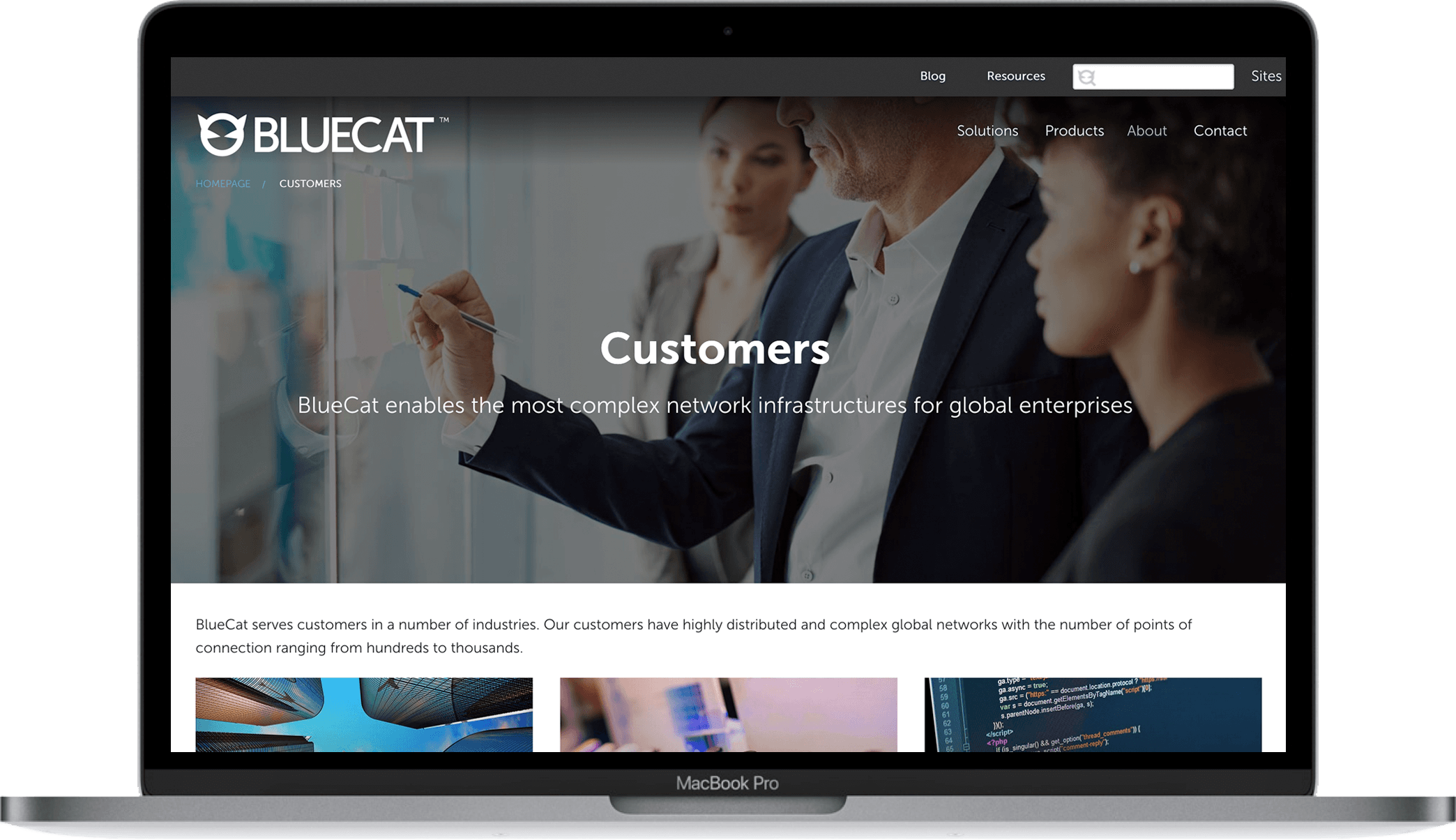
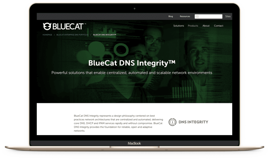
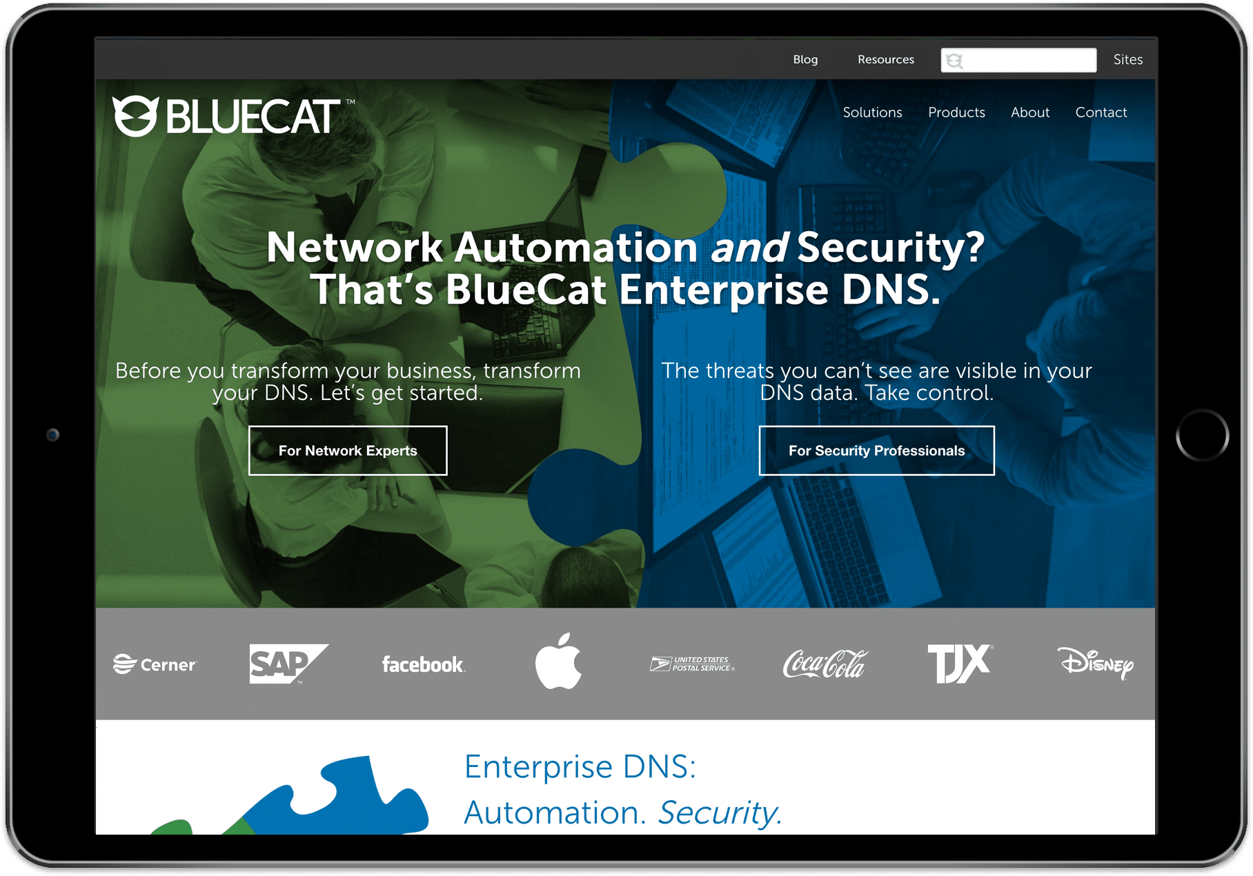
BlueCat’s existing website was standard for a B2B technology company website – pictures of people looking at server racks, overly dense, and jargon laden language. Visitors to the site were still asking the question: “but what do you DO?” Unsurprising, inbound leads were sparse.
The Solution
BlueCat’s website need to change to reflect the complex solution it was selling to a diverse set of buyers, with different pain points and priorities. The goal was to do a brand refresh and website redesign that would:
Reinforce messaging of Enterprise DNS as the intersection of networking and cybersecurity worlds, helping buyers navigate BlueCat’s DNS solutions for multiple personas in these two functions.
Simplify the overall messaging relating to all BlueCat solution offerings.
Uplift the visual appeal and improve navigation.
Increase website conversions.
Oh, and it had to be done in
8 WEEKS
My Role
I served a number of roles in this project including:
Project manager, responsible for managing an external development agency, SEO consultant, and the a cross-functional internal team including marketing, product management, human resources, sales and copywriters.
Art director, creating all imagery and iconography
Development, conducting all page-building in WordPress.
Strategy & Approach
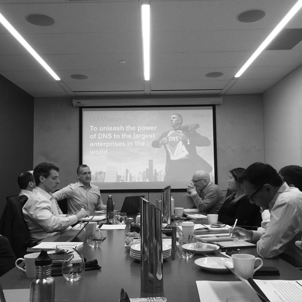
A two-day brainstorming session surfaced the challenges BlueCat faced in the market. The process prioritized the need for BlueCat to emphasize security as an integral part of the enterprise DNS vision. This became the foundation for the branding and marketing plans for 2018.
Brand Insight
DNS is the foundation of a network’s infrastructure, but DNS data can also provide invaluable insights with regards to cyberattacks. We discovered the majority of security teams weren’t leveraging that data. They may be the security experts but BlueCat knows and understands DNS and its role in security.
Previous
Next
Redefining the Brand
Through a series of exercises in the brainstorming session, key aspects of the brand were extracted and refined to define the brand’s personality: how it should look, sound, and act.
“DNS is serious, but we don’t take ourselves seriously. We need to communicate our expertise but approach it with a bit more of a playful attitude and personality. “
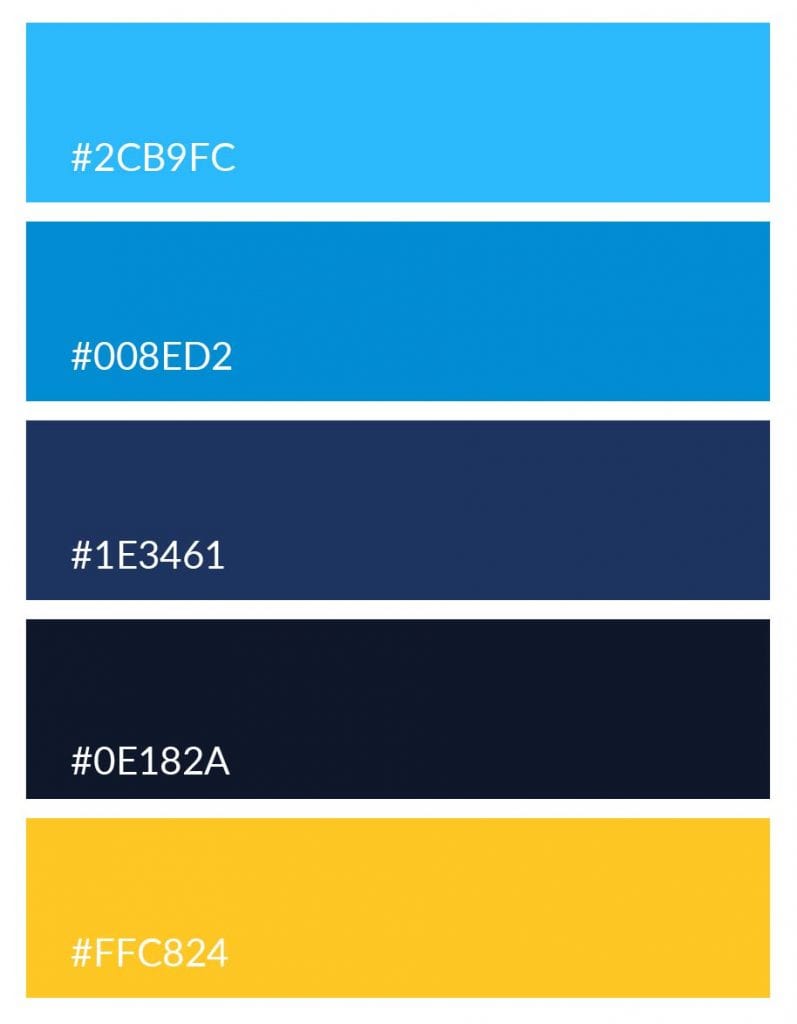
Brand Colours
The existing brand color scheme used blue for all security based pages,and green for all network infrastructure pages. While this seemed a good approach in theory, it fell apart when actually designing a page for a networking. Seeing a page in all green with a BlueCat logo felt incongruous.
"Nobody leaves this place without singing the blues"
The blue color scheme was fully embraced. The blue from the previous brand palette was brightened up, the green and grey were replaced and yellow was added as the main complimentary color to provide a pop of colour for all CTAs.
Brand Voice
The existing copy on the website had a tendency to lead with details about the technology. The content was reworked to have more personality with the buyer becoming the ‘Expert’ and BlueCat the ‘Brainy Sidekick’.
Priority was placed on crafting storytelling to clearly communicate BlueCat’s value proposition, features, benefits, and differentiation.
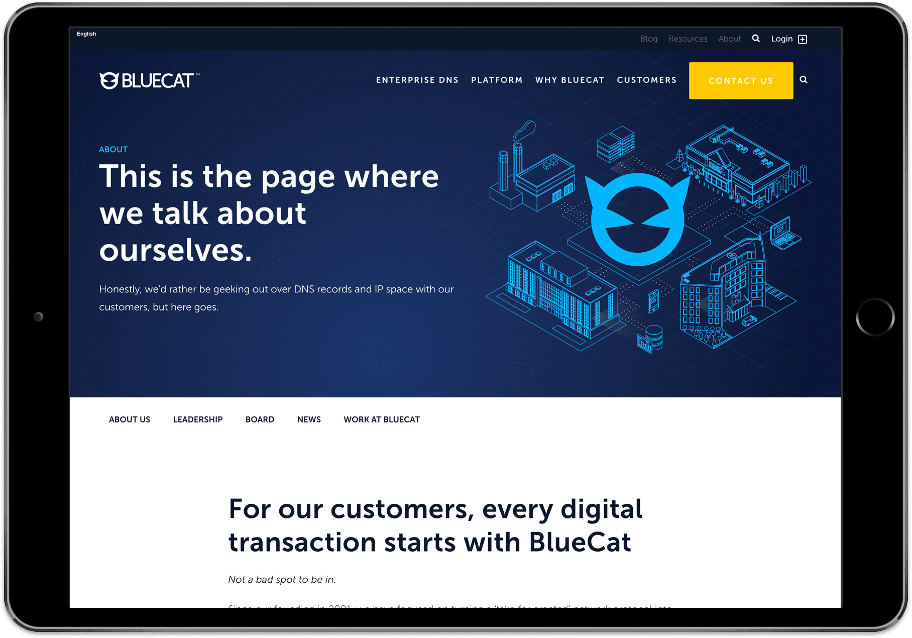
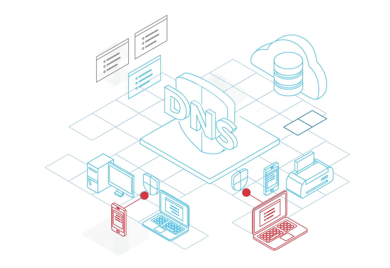
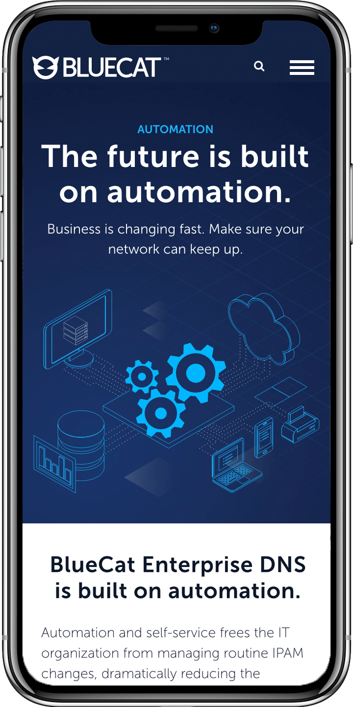
A Modular Approach to Imagery
A variety of options were explored for imagery, eventually choosing an outlined isometric illustration style. This style reflected a lighthearted way of illustrating complex concepts without coming across as “cartoonish”. It was also a subtle nod to the way many network engineers illustrate their technical architecture diagrams.
This illustration style also had the added benefit of being modular, allowing for rapid variations and reuse of components – an important factor in meeting the 8-week deadline.
Explainer Videos
Simultaneously to the development of the WordPress backend production began on a series of explainer videos. The isometric illustrations allowed us to animate in a rapid fashion.
Putting it all together
"My wife went on our website last week and said to me 'this is the first time I've actually been able to understand what you do' #Winning!”
The Results
Met Deadline
We met the initial 8-week deadline for re-brand and re-positioning and made adjustments and updates in the post launch period.
Increased Engagement
Page Visits and Avg Session Duration increased while simultaneously decreasing bounce rate
Conversions Increased
In the month following launch, conversions increased by 37% and have averaged 25% higher to date