Case Study
Using the power of connection to reimagine QuickPlay’s website
QuickPlay is a Canadian-based company that provides managed services for the distribution of premium video to multiscreen devices. The Quickplay platform powers mobile video services for live TV, video on demand, and radio services for companies including AT&T, Bell, Verizon, Motorola, Rogers, BlackBerry, Sirius XM, and U.S. Cellular.
The Challenge
In 2004, years before the first iPhone was released, QuickPlay Media started out making video applications for phones like the Motorola Razr. Over time their business model changed from making apps, to a SaaS-based model transcoding and enriching videos for content delivery.
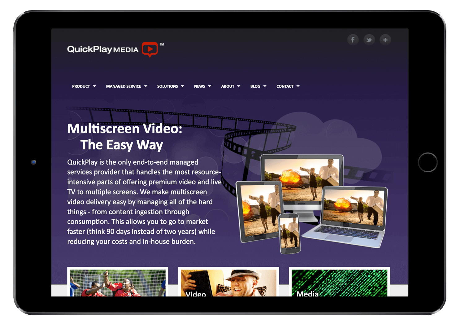
As Quickplay’s global growth accelerated both organically and through acquisition, there was a feeling that the overall brand image was dated not connecting with their target customers.
The Solution
In order to better reflect their position as the leaders in delivering video to any mobile device, we began a complete brand refresh, including new logo, and website redesign that would:
- Reinforce QuickPlay’s messaging as the leader in powering video delivery to any device
- Help differentiate QuickPlay in an increasingly crowded mobile video market
- Leverage the website for lead generation and increase conversions.
My Role
My primary roles were Creative & Art Direction, as well as WordPress development.
Strategy & Approach

The New Logo
The trademark on QuickPlay was recently granted, so the ‘Media’ was dropped from the name and a new logo was introduced.
After designing and refining numerous variations, the team chose a version with a red Q – to represent an abstract laptop – and the rest of the letters at a uniform height to imply stability and represent the longevity of the company.

Colour Palette
Quickplay’s traditional colour palette was red and black. While the predominant colour trends for tech companies at the time used red or blue and black/grey, we chose to stay with our original palette. To add differentiation, I gave the palette a boost by adding secondary colours for a fresh, contemporary feeling.
Not a soul to be found
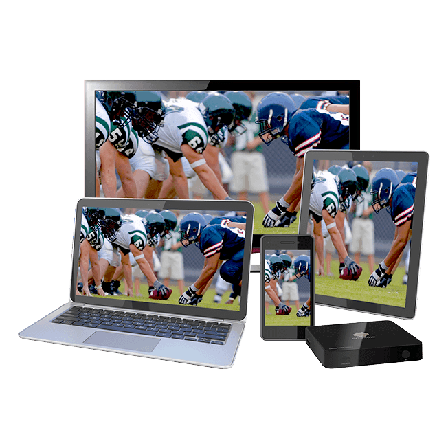
The design of the existing website focused too much on the technology (including devices which were outdated as soon as they came to market). Now that video on multiple mobile devices was becoming more common place, the website needed to be more compelling and reflect Quickplay’s change in approach to its overall value proposition.
The Personal Approach
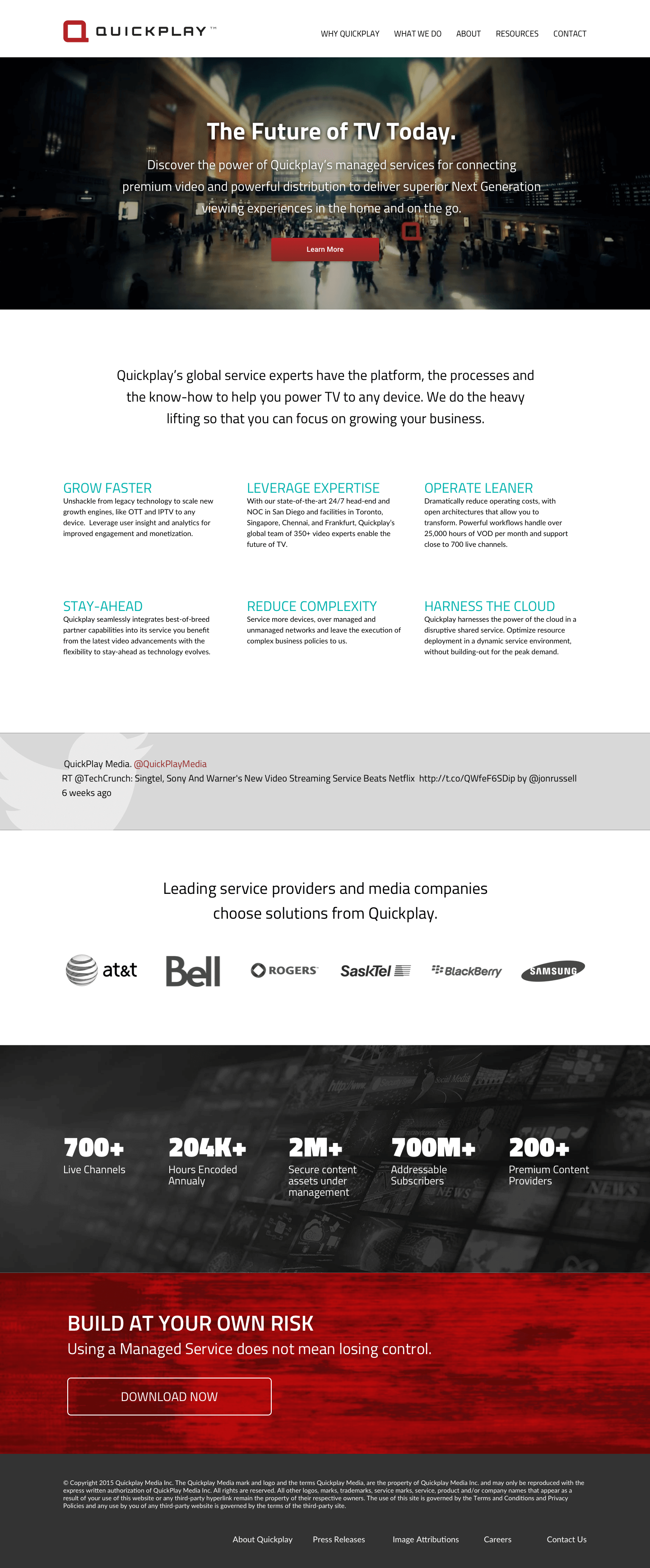
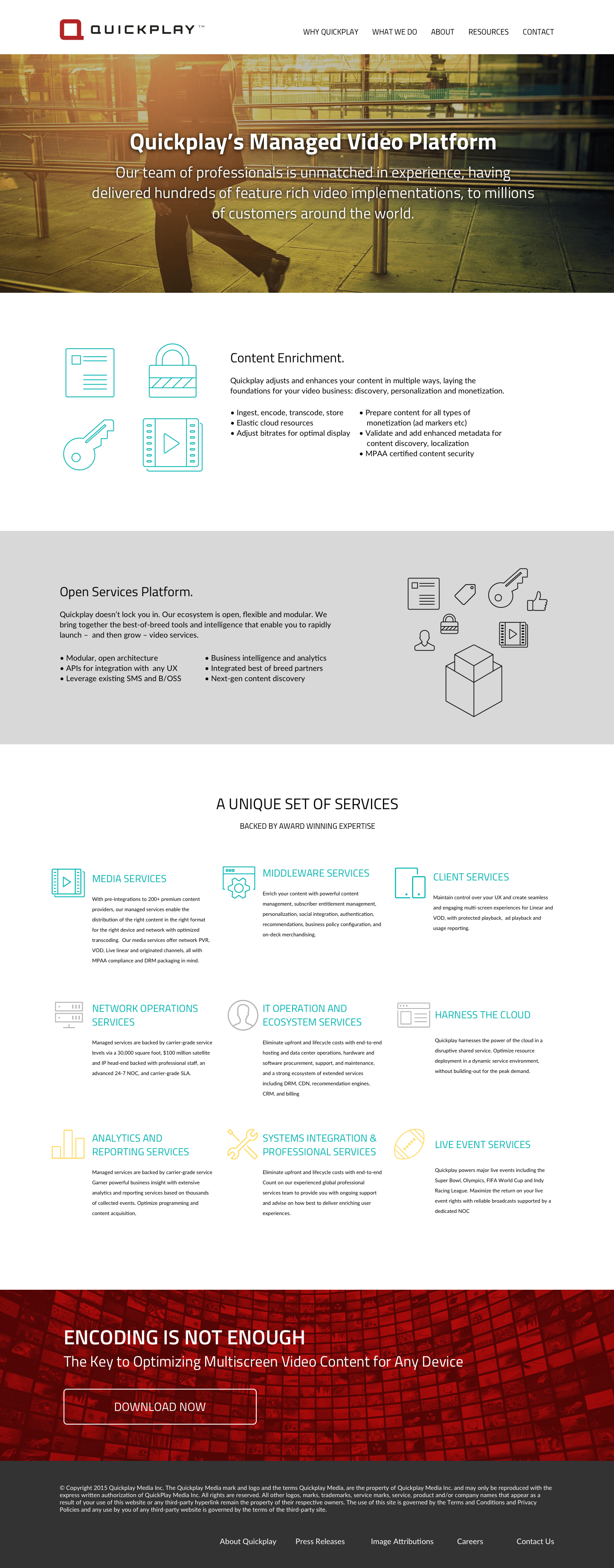
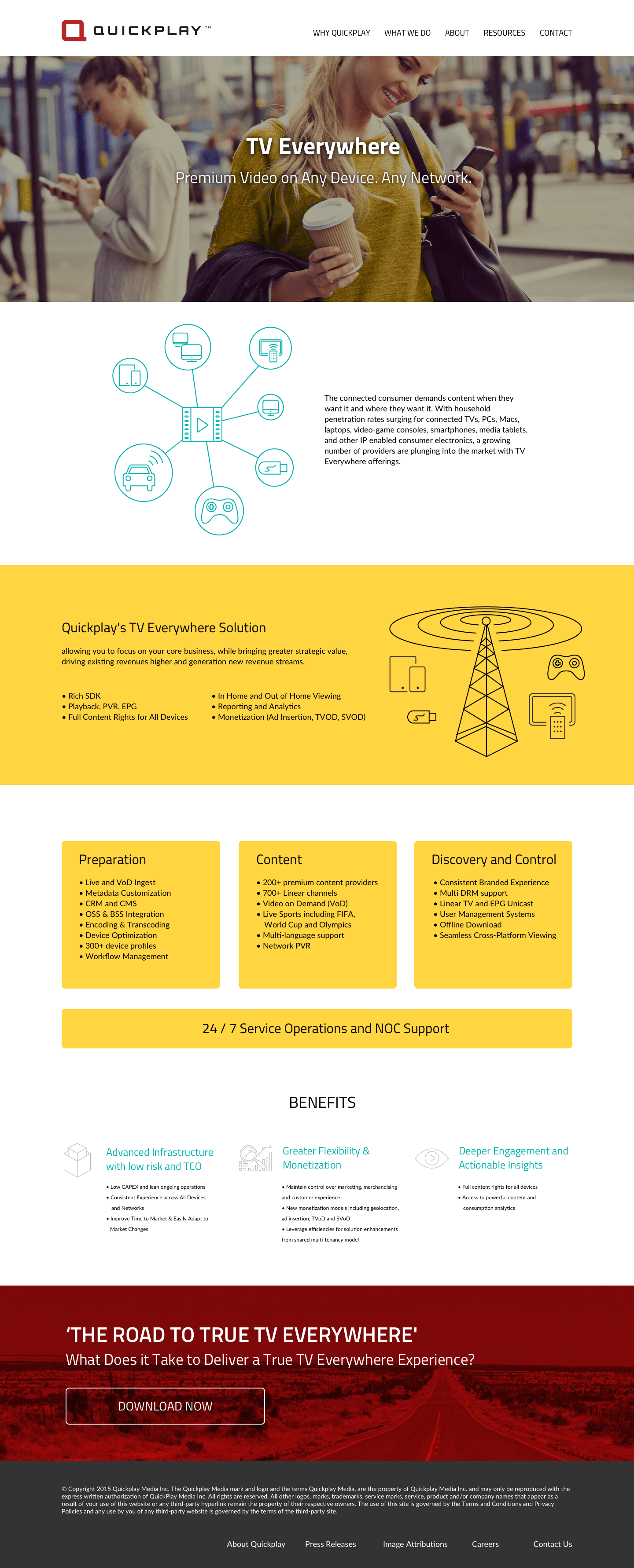
We determined that a human connection was missing. Instead of images of videos on a variety of devices (phones, tablets, computers), the website would instead illustrate HOW and WHERE the actual subscribers of our customers would watch videos on their devices.
Inbound Marketing
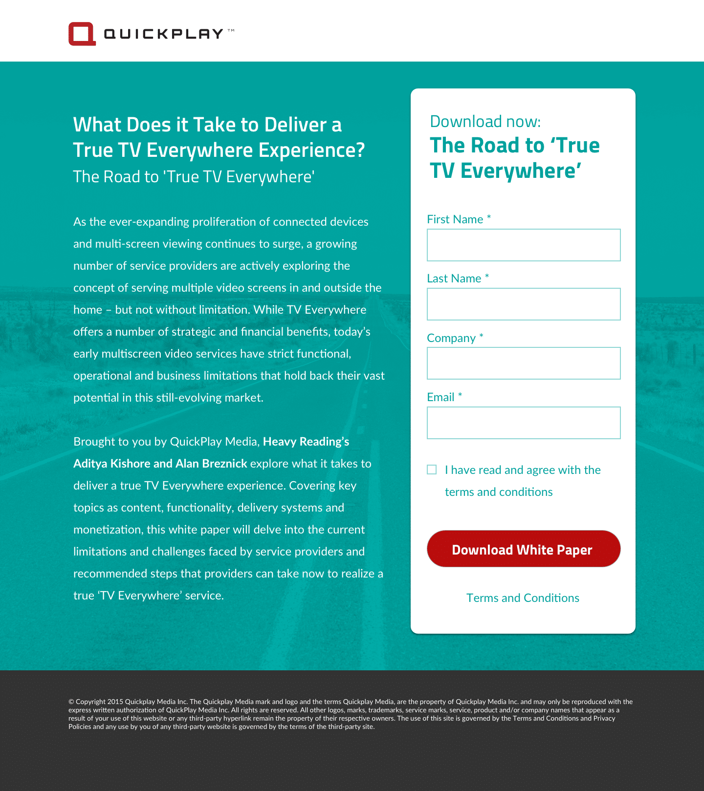
All website content was rewritten with clear calls to action to engage with and/or download content from our new resources section.
All campaign landing pages were redesigned with a new cleaner template that resulted in early tests showing a 10% lift in conversions.
The Final Result
Outcome
Conversions Increased
30% lift in lead acquisitions following redesign.
Increased Engagement
Page Views increased by 40% (uniques by 14%) while decreasing bounce rate by 15%.
New Family
12 months later, AT&T acquired QuickPlay from Madison Dearborn Partners


